

Welcome to our blog post on “Web Design Trends to Watch Out for in the Digital Era”! In today’s fast-paced and ever-evolving online landscape, staying ahead of the curve is crucial for businesses and individuals alike. In Kelowna, a city known for its vibrant tech scene, it’s essential to stay updated on the latest web design trends that can significantly impact user experience and engagement. This article explores cutting-edge design trends shaping the digital era, helping you create visually stunning, user-friendly websites that capture attention and drive results. Whether you’re a web designer, a business owner, or simply curious about the fascinating world of web design, this blog post is a must-read!
What are Web Design Trends?
Kelowna, a British Columbia, Canada city, has seen many web design trends emerge in recent years. One of the most noticeable trends is using vibrant colors and bold typography to create visually stunning websites that capture users’ attention. Another trend is responsive design, which ensures that websites are optimized for all screen sizes, including desktops, tablets, and mobile devices.
In addition to these trends, Kelowna’s web designers have incorporated more video content into their designs. This includes using background videos and creating explainer videos to showcase products or services. Another trend is using chatbots and other AI-powered tools to enhance user experience and improve website engagement. Overall, Kelowna’s web design trends reflect a commitment to creating visually appealing and functional websites that meet the needs of both businesses and consumers.
The Grid System in Web Design
The grid system in web design refers to a layout structure that helps designers create visually appealing and organized websites. By using a grid system, designers can create a consistent look and feel throughout the site, making it easier for users to navigate and find what they want. In Kelowna, grid systems in web design have become increasingly popular as businesses seek to improve their online presence and provide a better user experience for their customers. The grid system allows designers to create responsive designs that adapt to different screen sizes, ensuring the website looks great on any device. Overall, the grid system is an essential tool for web designers in Kelowna who want to create functional and attractive websites that effectively communicate their brand message.
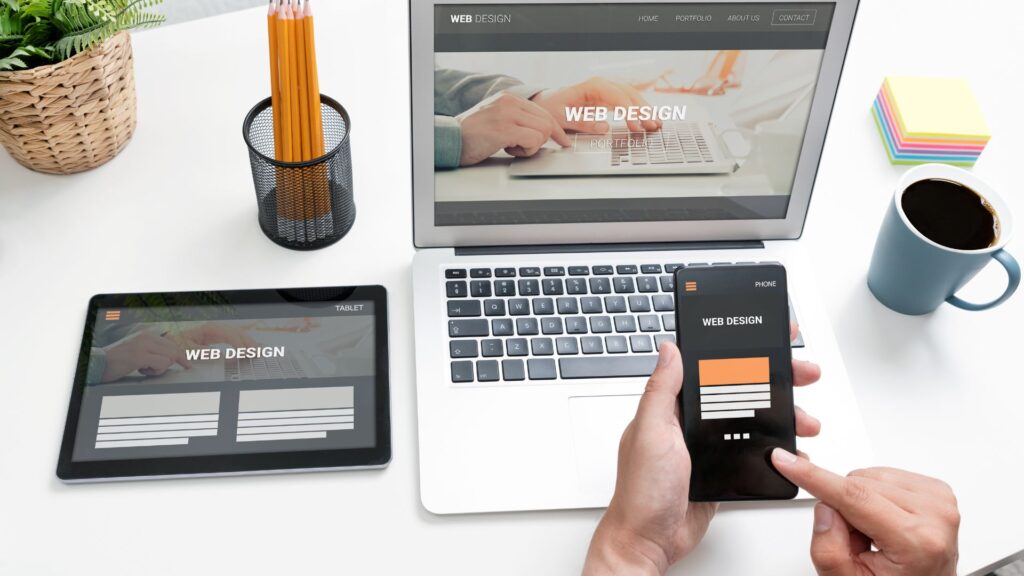
Key Benefits of Responsive Design
Responsive design offers numerous benefits for websites in Kelowna, as it does for websites globally. Here are some key benefits of responsive design specifically for the Kelowna area:

- Improved User Experience: Responsive design ensures your website looks and functions optimally across all devices and screen sizes. With many people accessing the internet through mobile devices in Kelowna, having a responsive website ensures a seamless and user-friendly experience for your visitors. It helps in reducing bounce rates and increases user engagement.
- Increased Mobile Traffic: Mobile internet usage has steadily increased worldwide, including in Kelowna. By implementing responsive design, your website becomes accessible and attractive to the growing number of mobile users in the area. This helps capture a larger audience and drive more traffic to your site.
- Local Search Optimization: Responsive design is vital in search engine optimization (SEO). Google and other search engines favor mobile-friendly websites in their search rankings. With a responsive design, your website is more likely to rank higher in local search results in Kelowna, making it easier for potential customers to find your business online.
- Cost-Effective and Time-Efficient: Maintaining a single responsive website is more cost-effective and time-efficient than managing separate websites for desktop and mobile users. Instead of creating and maintaining multiple versions of your website, a responsive design allows you to have a single website that automatically adapts to different devices and screen sizes. This reduces development and maintenance costs and the time required for updates.
- Enhanced Local Branding: For businesses in Kelowna, having a responsive website can contribute to building a solid local brand presence. When users have a positive experience browsing your website on their smartphones or tablets, they are more likely to remember and engage with your brand. This can increase brand recognition, customer loyalty, and word-of-mouth referrals within the local community.
- Competitive Advantage: While many businesses in Kelowna already have a web presence, not all have fully embraced responsive design. Adopting a responsive website gives you a competitive edge over competitors whose websites may need to be optimized for mobile devices. A user-friendly and visually appealing website can attract more visitors, keep them engaged, and convert them into customers.
Maximize User Experience with Responsive Design
Responsive design is critical in maximizing user experience for websites and digital platforms in Kelowna. It involves designing a website that can adapt to different screen sizes and devices, ensuring users have a seamless experience no matter how they access the site. With more people using mobile devices than ever, responsive design has become essential for businesses looking to reach their audience effectively. By optimizing the layout and functionality of a website, responsive design can improve user engagement and increase conversions. In short, responsive design is an essential tool for businesses in Kelowna looking to provide their customers with the best possible user experience.
Why is it Important to Stay Up to Date with Web Design Trends?
Staying up-to-date with web design trends is essential for businesses in Kelowna and beyond. In today’s digital age, a website is often the first point of contact between a company and its potential clients or customers. If a website needs to be updated or more professional, it can create a positive first impression and drive potential customers away. By staying current with web design trends, businesses can ensure that their website stays visually appealing and engaging to visitors.
In addition to aesthetics, staying up-to-date with web design trends ensures that a website remains functional and user-friendly. Movements such as responsive design, which allows websites to adapt to different screen sizes and intuitive navigation, are crucial for providing an optimal user experience. By keeping pace with these trends, businesses can ensure that their website offers a seamless experience for all visitors, regardless of their device or level of technical expertise. Ultimately, staying up-to-date with web design trends is an investment in the success of any business’s online presence.
Tips for Implementing Web Design Trends into Your Website
If you’re looking to implement web design trends into your website in Kelowna, here are some tips to consider:
- Research current trends: Stay current with the latest web design trends by researching popular websites, design blogs, and industry publications. Identify the trends that align with your brand and website goals.
- Prioritize mobile responsiveness: With the increasing use of mobile devices, ensuring your website is mobile-friendly and responsive is crucial. Optimize the design for different screen sizes to provide a seamless user experience across devices.
- Simplify the design: Minimalism and simplicity are enduring trends in web design. Streamline your website’s layout, use ample white space, and focus on clear and concise messaging. Ensure your design elements, such as navigation menus and buttons, are easily accessible and intuitive.
- Choose a cohesive color palette: Select a color scheme that complements your brand and creates a visually pleasing experience. Consider using gradient overlays, vibrant hues, or contrasting colors to add depth and visual interest to your website.
- Utilize engaging typography: Typography plays a significant role in setting the tone of your website. Experiment with unique fonts and typography styles to make your content more exciting and visually appealing. Ensure that the chosen fonts are legible across different devices and screen sizes.
- Incorporate multimedia elements: Engage your visitors with interactive and multimedia features. Consider incorporating videos, animations, illustrations, and high-quality images to enhance the visual experience. However, use these elements sparingly to avoid overwhelming the user.
- Implement micro-interactions: Micro-interactions are small, subtle animations or effects that provide user feedback, enhancing the overall user experience. These can be applied to buttons, navigation menus, form validation, and other interactive elements to make the website more engaging.
- Embrace asymmetrical layouts: Move away from traditional grid-based arrangements and experiment with asymmetrical or broken grid designs. This approach can add a unique and dynamic visual appeal to your website.
- Prioritize page loading speed: In a fast-paced digital world, users expect websites to load quickly. Optimize your website’s performance by compressing images, minifying CSS and JavaScript files, and utilizing caching techniques. This will ensure a seamless user experience and improve your website’s search engine rankings.
- Test and iterate: After implementing design changes, gathering user feedback and analyzing website metrics is important to understand how well the changes are received. Use tools like heatmaps, user recordings, and A/B testing to refine your design and continuously improve the user experience.
Conclusion
In conclusion, staying on top of web design trends is crucial in the fast-paced digital era. At FaZZ Media in Kelowna, we understand the importance of keeping our clients’ websites fresh, engaging, and user-friendly. By incorporating emerging design trends such as dark mode, micro-interactions, and immersive storytelling, we aim to create memorable online experiences that captivate audiences and drive business growth. Contact FaZZ Media today to collaborate on transforming your website into a cutting-edge digital masterpiece that leaves a lasting impression.


